

|
||||||
|
Movies | ||||||
|
||||||
|
||||
About the Avatar Continuum |
||||
Many years ago I created a few avatars to use with online chat programs, storing them on my personal website so I wouldn't lose them, and letting my friends access them as well. Those few avatars quickly turned into dozens, hundreds, then thousands. When they went over 10,000 in number it was clear that they needed a website of their own, and the Avatar Continuum was created. |
||||
The Avatar Continuum has constantly grown over the years. It's been updated and redesigned many times, several of which were scrapped and never seen. It's gone through phases of being updated weekly, monthly, and even periods where it just sat here with no updates for over a year. As with most things in life, it's seen a lot of change since it's creation in 2007. |
||||
There are a few things that will never change however. The first is that I create every single avatar myself by purchasing the required media, take screenshots while viewing it, then editing those screenshots into avatars afterwards. The second is there are no distractions or hoops to jump through. There's nothing to sign up for, no account creation, no advertising or popups, and no links that lead to anywhere outside of the site itself. |
||||
The only thing you will ever find at the Avatar Continuum is avatars. Because of this, I rely on those who visit this website to spread the word about it. If you enjoy this website please tell your friends it exists. |
||||
How The Site Was Created |
||||
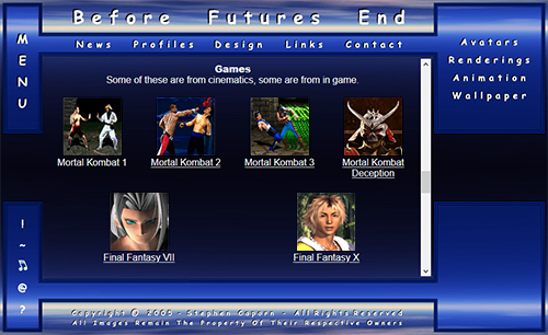
The earliest predecessor to the Avatar Continuum was a website called Before Futures End I created around 2001, It was my personal website which would essentially be my own version of facebook or myspace. It was somewhere I could post diary updates, show off my design work, share photos I'd taken, and as you can probably tell by this list, was the first place which I started to upload my avatars to. A lot of my websites focused more on design and appearance instead of being easy to use. Each menu option at the top would load extra options in the corner to it's right. It also had an almost separate mini site within it with menu options in the bottom left corner. Clicking these would allowing you to play music, display random quotes or small animations I'd created in the empty area in the bottom right corner without interrupting or changing anything else on the site. |
||||
 |
||||
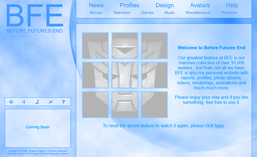
The next few BFE sites were pretty much identical in design with only minor text and menu changes. Avatars went from having their own page to their own section with links to individual categories like movies, television, games, etc. This website design also used a lot of Flash animations lead to fancy homepage features like avatars moving around when you click them. When I created Transformers avatars for example I had a single Autobot logo avatar on the home page which when clicked would cause more avatars to emerge from it and move around to form a larger version of the Autobot logo as if the image itself were transforming. Like the previous site, this version had it's own section that almost acted like a mini website inside it. This time the menu buttons and the window were right next to each other instead of opposite sides of the screen, but they remained in an incomplete 'Coming Soon' state that was never completed. |
||||
 |
||||
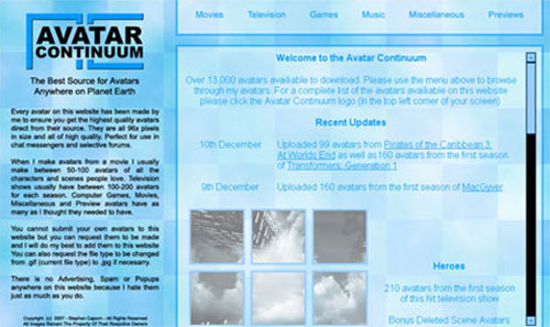
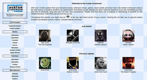
When the number of avatars went past 10,000, I decided it was time they had a website of their own. After a few horrible name ideas like 96x (the avatars I created are 96x96 pixels in size) or something with the word digital in it, I eventually decided upon the Avatar Continuum. While the site name was new, the site design was a reskin of the BFE site before it. It featured the first appearance of the Avatar Continuum logo which would be slightly modified over the years as well as the checkered background. This version of the site had several issues. It's use of colours gave it an almost blurry appearance. The checkered background would stick around for many years to come, but when used with this layout it almost looked like a glitch or graphical error. Both of these things combined made the site look very noisy and crowded, which was a distraction for a site who's purpose was to be visually appealing and allow other people to enjoy it's graphical content. |
||||
 |
||||
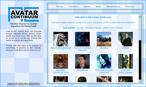
For the next version of the site, I kept the same layout design and attempted one final reskin to try to make it more appealing. The colours were changed to a lighter blue and white tone which would pretty much become standard for the every site since, which gave the site a more simple clean and less distracting look. The logo was moved down a bit, and the text beneath it reduced to give the site a less cramped appearance. To help with this I stopped using complicated flash animation and removed the mini site within the site that was in the corner of the previous few versions. I also created a more defined and separate menu and main body of the site with a slightly lighter background from the rest of the background to give it a slightly layered appearance. |
||||
 |
||||
All the sites until this point have been 'postcard' sites which had a fixed height/width. While this worked okay early on when screen resolutions were lower, as technology improved and screen resolutions increased, the sites appeared smaller and smaller on the screen. The previous 3 sites had all been the same layout with a different skins, and it was well past time for a complete redesign. The new design split the menu to the left of the site and the avatars to the right. While the menu on the left would stay in place, the main body of the website would stretch, the space between the avatars expanding or contracting, so it would fit the browser window. I also upgraded the menu and added genre's to every avatar category in order to make it easier to find whatever you wanted. I also started including secret avatars to the site. When viewing a movie or television show, you would occasionally see an eye icon in the corner of the site. Clicking it would take you to a page containing avatars made from media that didn't make it into the finished version of the show or movie such as deleted scenes, trailer tootage or other concept material. |
||||
 |
||||
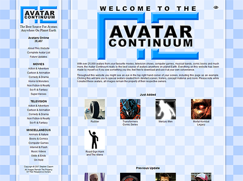
While the sites were too small for the longest period of time, the previous website felt too empty when viewed in a larger browser window at a higher resolution. The menu was stuck to the very left of the screen while the avatars were spread too far apart across most of the screen. What it needed was a way to make the site feel more uniform across both small and large browser windows. To fix this I split the site into 3 separate sections. The menu, main body and the background. Both the menu and main body had a fixed width, but they were always centered in the middle of the screen and you would see either more or less of the background on either side depending on the browser windows size. Basically only the background would change but the site would stay the same. A simple solution that looked much better no matter what browser window or screen resolution you used. Visually the site improved a lot. The menu and main body of the site were semi transparent glassy layers which seemed to float above the checkered background, which gave the site a sense of depth to it and didn't feel so flat. It also featured a long overdue upgrade to the Avatar Continuum logo itself. The background, logo and floating glass would become the basic recongnisable elements for a very long time, each receiving only minor updates over time. |
||||
 |
||||
As time passed the site continued to look great. I didn't want to change anything on it but had gradually developed a new problem. As the categories and genres to the left of the website increased as I added thousands of new avatars to the site, it reached a point where you had to scroll down the site just to access some parts of the menu. This took me quite a while to figure out a solution as the number of genre's in each avatar category would only continue to grow over time. I moved the menu section of the website from the left of the site to the top of it, creating a menu similar to the first ever version of the Avatar Continuum, I then used used CSS to make the genre's appear as a drop down menu whenever you moved the mouse over the categories. This let you access every avatar on the website within two mouse clicks, but also kept the site look clean and kept the stuff you might not need to see hidden until needed. |
||||
 |
||||
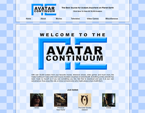
The layout of the next major update is identical to the previous version of the site, but with a few graphical changes. The background is now a slightly paler white/blue colour and is animated, constantly moving to the right in a never ending loop, adding a sense of movement and life to the site. I didn't want this to become distracting though so I made the glassy layers slightly thicker and frosted in appearance to make the movement behind it less distracting. The logo is slightly bolder and casts a shadow on the glassy layer, helping it look like it's floating above it. While the glassy layer casts it's own shadow on the checkered background, helping it look like it's floating above that. This really gave all these elements a sense of depth of being of floating above each other. The biggest change was removing the CSS Menu. Clicking Movies, Television, Video games and Miscellaneous will now take you to a complete list of all movies or tv shows, etc, instead of displaying dozens of other category links and unnecesarry pages. I also changed was spacing the menu text. Grouping the links about the site including Home, About and Search on the left from the links that lead to the avatars including Movies, Television, Video Games and Miscellaneous on the right. |
||||
 |
||||
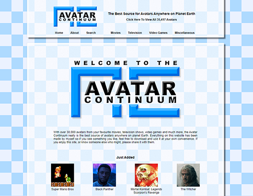
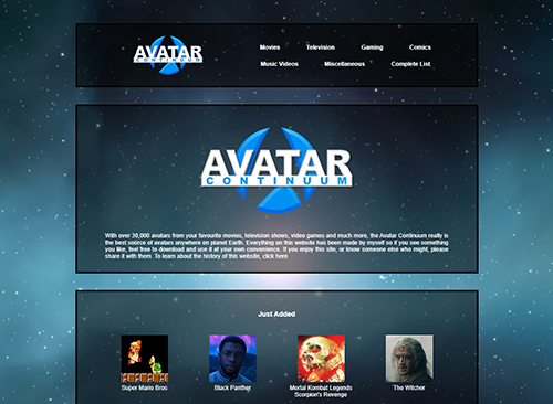
It would be a couple of years before the next update which is the current version of the website. While I've continued to make avatars from time to time, it has been a very long time since the site saw any serious type of upgrade so I decided to do a complete redesign for it's revival. Pretty much everything has been totally changed apart from the rough layout. The background is now a blue and white space nebula with stars. The stars will constantly float towards the screen in a never ending loop without start or end. If for some reason a computer can't display the animated background then a single static image of it loads in it's place. For the logo I decided on a Star Trek delta shape, visible in the negative space (empty space in the middle of the blue circle) with the text floating in front of it. The delta itself is recognisable even without the text which is what I wanted, and the circular design stands out against the square shaped avatars on the site. The site layout is probably the most recognisable or unchanged thing from it's previous design. It's 3 primary elements remain. Menu, Main Body and Background. I simplified the Menu section by removing the sites catchphrase that has been displayed above the menu options since the very first version of the Avatar Continuum. The menu now consists of only the Logo on the left and the categories on the right. Clicking the logo returns you to the homepage, and the number of categories has a few new additions including avatars for Comics/Books and Music Videos. |
||||
 |
||||
|
||||
|
||||||
| Copyright © 2007 Stephen Caporn - All Images Remain the Property of Their Respective Owners |
||||||
|
||||||